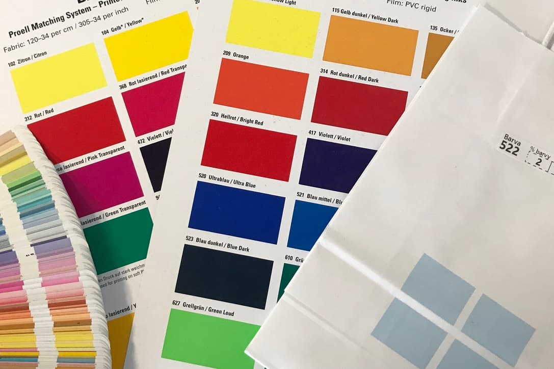
When requesting bags with print, we create graphic previews for customers in colors according to Pantone swatch books. The supplied print data is usually in CMYK colors. Converting from CMYK to Pantone C swatch book for silkscreen is not that complicated. Problems can arise when converting to Pantone U, even from Pantone C swatch book.

The image above is a typical example that the same number from two different series does not always mean the closest mutual shade. Here we recommended shade 321 U for printing, which was the closest to the original color 7474 C of all shades.
Difference between Pantone C and U
It is generally known that the C series, i.e. Coated, is primarily intended for coated paper. Shades of the U series - Uncoated are for uncoated paper. However, this definition does not apply so much to us, because we use the same bags for both silkscreen and flexography.

Pantone C for silkscreen and offset print
These inks are thicker and significantly more expensive compared to flexography. In silkscreen printing, the ink needs to be like a "paste" that we must push through the screen and print on the bag. It is precisely the thickness and higher ink consumption that ensures better opacity, thanks to which we manage to achieve some colors according to Pantone C even on uncoated materials in silkscreen printing. Not only for this reason, silkscreen printing prices are more expensive than flexography.
Pantone U for flexography
Thick inks cannot be used for this technology. When applying ink to the printing plate, it is necessary to have ink captured only on the printed motif. When using thicker inks, the ink would stay even outside the desired areas. It is therefore necessary to have more watery inks, which are absorbed very quickly into the material and are dry on the surface. However, this means the print cannot be as bright and vibrant as in silkscreen printing.